How to Use Excel Like a Data Analyst
Learn how to use Excel like a data analyst with 9 practical skills, from PivotTables to Power Query, that turn raw data into real answers.
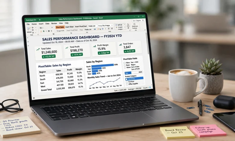
How to use Excel like a data analyst comes down to one shift in mindset: you stop treating the spreadsheet as a place to store numbers and start treating it as a tool for asking questions. Most people who open Excel every day never get past typing in totals and coloring a few cells. Data analysts use the same program, but they use maybe fifteen percent of it that most users never touch, and that fifteen percent is where the real value lives.
The good news is you don’t need a certification or a computer science degree to get there. You need to learn a handful of functions and habits that show up in almost every real analysis: cleaning data before you trust it, using lookup formulas instead of scrolling and squinting, building PivotTables instead of manual summaries, and knowing when a chart tells the story better than a table of numbers. None of this is exotic. It’s the stuff analysts use every single day because it works.
In this guide, I’ll walk through exactly how to use Excel like a data analyst, step by step. We’ll cover data cleaning, the formulas that actually matter, PivotTables, charts, conditional formatting, Power Query, and a few habits that separate someone who’s comfortable in Excel from someone who can genuinely analyze data in it. By the end, you’ll have a practical framework you can apply to your very next spreadsheet, not just a list of features.
Why Excel Is Still a Data Analyst’s Go-To Tool
Before getting into the how, it’s worth addressing the “isn’t Excel outdated?” question, because it comes up a lot. It isn’t. According to Microsoft’s own product documentation, Excel remains one of the most widely deployed data tools in business, and for good reason: almost every company already has it, almost every stakeholder already knows how to open it, and it handles small to medium datasets faster than setting up a database ever would.
Data analysts rarely reach for Python or SQL as a first move. They open Excel, poke around, and get a feel for the data. Only when a dataset gets too large or the analysis gets too complex do heavier tools come into play. So learning how to use Excel like a data analyst isn’t a stepping stone you outgrow. It’s a permanent, transferable skill that pays off whether you’re working in finance, marketing, healthcare, or retail.
A few reasons Excel holds up:
- It’s already installed on most work computers, so there’s zero setup friction.
- It handles the exploratory phase of analysis better than most specialized tools.
- Stakeholders who don’t code can still open, review, and even edit an Excel file.
- It scales down to a single messy CSV and scales up to complex financial models.
1. Start With Data Cleaning, Not Formulas
Every experienced analyst will tell you the same thing: dirty data ruins good analysis. Before you build a single formula, you need to know your data is trustworthy. Skipping this step is the single biggest difference between beginners and people who actually know how to use Excel like a data analyst.
Spot and Remove Duplicates
Use Data > Remove Duplicates to catch repeated rows before they inflate your totals. A duplicated sales entry doesn’t just look messy, it quietly skews every average and sum built on top of it.
Standardize Text and Formats
Inconsistent entries like “NY,” “N.Y.,” and “New York” in the same column will break your PivotTables and lookups. Use functions like TRIM(), PROPER(), and SUBSTITUTE() to clean text fields before analysis, not after you notice something’s off.
Handle Blanks and Errors Deliberately
Don’t just delete blank cells. Decide whether a blank means zero, means missing, or means “not applicable,” because each of those tells a different story. Use IFERROR() to catch formula errors gracefully instead of letting a single #N/A break your entire report.


Check Data Types
A date stored as text won’t sort correctly and won’t work in date-based formulas. Numbers stored as text won’t sum. This is one of the most common silent errors in spreadsheets, and it’s worth a quick visual scan (numbers align right, text aligns left by default) before you trust any calculation.
2. Master Lookup Functions: VLOOKUP, INDEX MATCH, and XLOOKUP
Lookup functions are the backbone of Excel data analysis. If you’re combining data from two different sheets or tables, this is how you do it without copying and pasting by hand.
VLOOKUP
VLOOKUP searches for a value in the first column of a range and pulls back a corresponding value from another column. It’s the classic function for merging product names with prices, or employee IDs with departments. Its main limitation: it only looks to the right of the search column.
INDEX MATCH
INDEX MATCH does the same job as VLOOKUP but more flexibly. It can look in any direction, it’s faster on large datasets, and it doesn’t break if you insert a new column. Most experienced analysts prefer it over VLOOKUP for exactly that reason.
XLOOKUP
If you’re on a current version of Excel, XLOOKUP is the newer, more forgiving version of both. It searches in either direction, defaults to an exact match (avoiding a classic VLOOKUP mistake), and returns a custom value instead of an error when nothing is found.
Why this matters: learning to combine datasets with lookup functions is one of the clearest signals of knowing how to use Excel like a data analyst, because almost no real-world dataset lives in a single, tidy table. You’re constantly merging customer lists with order histories, or product IDs with inventory counts.
3. Build PivotTables to Summarize Data Fast
If there’s one Excel feature that defines analyst-level work, it’s the PivotTable. A well-built PivotTable turns thousands of rows of raw transactions into a clean summary in seconds, without a single formula.
What PivotTables Do Well
- Summarize totals, averages, counts, and percentages by category
- Group data by date ranges (weekly, monthly, quarterly) automatically
- Let you drag and drop fields to instantly reframe the question you’re asking
- Filter and slice data interactively without touching the source
A Simple Workflow
- Select your raw data range (make sure headers are clean and consistent).
- Go to Insert > PivotTable.
- Drag your category field (like region or product) into Rows.
- Drag your numeric field (like revenue or units sold) into Values.
- Change the summary type if needed (sum, average, count).
- Add a second field to Columns to compare categories side by side.
Once you’re comfortable with the basics, add Slicers for a clickable filter interface, and pair your PivotTable with a PivotChart so stakeholders can see the trend, not just read the numbers. According to guidance from Coursera’s data analytics resources, PivotTables are consistently ranked among the most valuable Excel skills for anyone doing regular data work, precisely because they replace hours of manual summarizing with a few clicks.
4. Use Conditional Formatting to Spot Patterns Instantly
Numbers on a page don’t tell a story until your eye can find the pattern. Conditional formatting does that work for you by highlighting values based on rules you set.
Practical Uses
- Color scales to show performance gradients (red to green) across a sales table
- Data bars to visualize magnitude directly inside a cell, without a separate chart
- Icon sets to flag status at a glance (up arrows, warning triangles, checkmarks)
- Custom rules to highlight outliers, like any value more than two standard deviations from the mean
This isn’t decoration. It’s a diagnostic tool. A well-placed conditional format can reveal a data entry error or a genuine outlier faster than scrolling through a thousand rows ever could.
5. Learn the Formulas Analysts Actually Use Daily
You don’t need to memorize all 500-plus Excel functions. Analysts return to a small, reliable toolkit again and again.
Core Aggregation Functions
SUM(),AVERAGE(),MEDIAN()for basic statisticsCOUNTIF()andCOUNTIFS()to count entries that meet one or more conditionsSUMIF()andSUMIFS()to total values based on specific criteria
Logical and Conditional Functions
IF()for basic decision logic- Nested
IF()orSWITCH()for multiple conditions IFERROR()to keep broken formulas from derailing a whole report
Text and Cleanup Functions
CONCAT()orTEXTJOIN()to combine fields, like first and last namesLEFT(),RIGHT(), andMID()to extract parts of a stringTRIM()to remove stray spaces that silently break lookups
Statistical Functions for Deeper Analysis
If you want to go beyond summaries, Excel supports regression analysis and correlation testing through the built-in Analysis ToolPak add-in. This lets you test relationships between variables, such as whether marketing spend actually predicts sales, without leaving the spreadsheet. It’s not a replacement for dedicated statistical software, but for a first pass, it’s genuinely useful.
6. Automate Data Prep With Power Query
This is the step most self-taught Excel users skip entirely, and it’s a shame, because it’s arguably the biggest productivity upgrade available. Power Query (found under the Data tab) lets you import, clean, and reshape data from multiple sources automatically, and then refresh that process with a single click whenever the source data changes.
What You Can Do With Power Query
- Pull data from multiple Excel files, CSVs, or databases into one clean table
- Remove duplicates, split columns, and fix formatting through a repeatable, recorded set of steps
- Merge or append tables without manual copy-pasting
- Refresh the entire process automatically when new data comes in, instead of redoing the cleanup from scratch every week
Once you’ve set up a Power Query workflow once, you save that time every single time the data updates. This is the closest thing Excel has to true automation, and it’s a major part of what separates someone doing analysis casually from someone doing Excel data analysis as a repeatable, reliable process.
7. Turn Numbers Into Charts That Actually Communicate
A table of numbers proves you did the work. A chart proves the point. Knowing which chart to use, and when, is a skill in itself.
Choosing the Right Chart
- Line charts for trends over time (revenue by month, traffic by week)
- Bar or column charts for comparing categories (sales by region, headcount by department)
- Scatter plots for showing relationships between two variables, especially after a regression analysis
- Pie charts sparingly, and only when you have a handful of categories that genuinely add up to a whole
Formatting Tips That Matter
- Cut anything that doesn’t help the reader understand the point faster: gridlines, 3D effects, extra legends
- Label your axes clearly instead of relying on a reader to guess
- Use consistent colors across a report so the same category always reads the same way
- Add a short title that states the takeaway, not just the topic (“Revenue Dipped in Q3” beats “Quarterly Revenue”)
8. Build Dashboards, Not Just Reports
Once you’re comfortable with PivotTables, charts, and conditional formatting, the natural next step is combining them into a single-page dashboard. This is where a lot of Excel data analysis work ends up living, because stakeholders rarely want to dig through raw data themselves. They want a summary they can glance at.
What a Good Excel Dashboard Includes
- A handful of key metrics at the top, big and easy to scan
- One or two charts showing trend or comparison, not ten
- Slicers connected to your PivotTables so viewers can filter without editing formulas
- Consistent formatting so it reads as one cohesive report, not a patchwork of pasted charts
Keep it simple. A cluttered dashboard with fifteen charts is harder to use than a plain spreadsheet. The goal is clarity, not volume.
9. Think Like an Analyst, Not Just a Spreadsheet User
Tools only get you so far. The habits underneath them matter just as much.
Ask the Question Before You Touch the Data
Know what decision your analysis needs to support before you start building formulas. It’s easy to spend an hour building a beautiful summary that answers a question nobody actually asked.
Sanity-Check Your Numbers
If a total looks surprisingly high or low, don’t move on. Trace it back. A misplaced decimal or a duplicated row can quietly throw off an entire report, and it’s much easier to catch early than after you’ve presented it.
Document Your Steps
Leave a note, a comment, or a separate tab explaining what a formula does and why. Six months from now, neither you nor anyone else will remember the logic behind a complex nested formula without it.
Know When to Leave Excel
Part of using Excel like a data analyst is recognizing its limits. Once a dataset runs into the millions of rows, or the analysis needs something Excel can’t do well (like advanced machine learning), tools like Python, R, or SQL take over. Knowing when to switch tools is itself an analyst skill.
Common Mistakes That Make Excel Work Look Amateur
- Leaving raw, unformatted data in the same tab as your summary, forcing readers to hunt for the actual answer
- Hardcoding numbers into formulas instead of referencing cells, which breaks the moment the source data changes
- Skipping error handling, so a single
#REF!or#N/Acell undermines an otherwise solid report - Using pie charts for data with more than five or six categories, which turns a chart into a confusing wheel of slices
- Never naming ranges or tables, which makes formulas harder to read and easier to break
Avoiding these isn’t glamorous, but it’s exactly what separates functional spreadsheets from ones people actually trust.
Frequently Asked Questions
Do I need to know coding to use Excel like a data analyst? No. Excel’s formulas, PivotTables, and Power Query cover the vast majority of real-world analysis without a single line of code. Coding becomes useful once your datasets get very large or your analysis gets statistically advanced, but it isn’t a prerequisite for solid Excel work.
What’s the fastest way to get better at Excel data analysis? Work with real data, even messy, imperfect data from your own job or a public dataset. Reading about PivotTables is nothing like actually building one on a dataset with a hundred inconsistent entries you have to clean first.
Is Excel enough for a data analyst job, or do I need other tools too? Excel is usually the starting point, not the whole toolkit. Most analyst roles eventually expect familiarity with SQL for pulling data and something like Tableau or Power BI for advanced visualization, but strong Excel skills remain a genuine, standalone asset on their own.
Conclusion
Learning how to use Excel like a data analyst isn’t about memorizing every function in the ribbon. It’s about building a repeatable process: clean your data first, use lookup functions and PivotTables to organize it, apply conditional formatting and charts to make patterns visible, automate the repetitive parts with Power Query, and always ask what decision your analysis is meant to support.
Do that consistently, and Excel stops being a place where numbers sit and starts being the tool that helps you actually understand them, which is the whole point of analysis in the first place.